
OnTech & Google Nest
E-commerce website redesign for catalog and professional installations of Google Nest products.
SUMMARY
TL;DR (too long; didn't read)
ROLE
Lead Designer - Sr. Product Designer
TOOLS USED
-
Figma
-
Photoshop
-
Quantum Metrics
-
JIRA
CHALLENGE
The website was outdated and didn't accurately reflect the OnTech brand, decreasing sales, user trust, and customer retention. Business goals were in place to increase conversion rates, as listed below.
Key Performance Indicators (KPIs) & Objective Key Results (OKRs)
-
Simplify the customer flow and reducing the dependence of agent-placed orders
-
Shift from 52% web and 48% agent-placed orders to a more favorable ratio of 60% web and 40% agent
-
Projected to increase the conversion rate from 6.9% to 8.0%
-
Increase conversion rates (CVR) by creating a seamless shopping experience on our partner landing pages
-
Increase average order value (AOV) by clearly displaying their savings as they buy more
-
Increase visitors by fixing index issues while maintaining CVR and AOV
SOLUTION
I led the design team on the landing page redesign. We focused on creating an upscale, white-glove experience to increase user trust and create a more enjoyable experience.
Results
-
Within the first week of launch we had already superseded the expected metric by an additional 3.4%
-
The expectation was to decrease agent-placed orders by 8%, and we achieved a decrease of 11.4%
-
For conversions, we reached a 4.6% increase of Google web conversions
-
95% QXscore (out of 100%) on UserTesting, which directly correlated to a great user experience
PROCESS
I led the redesign of the web page so it was more aligned to OnTech as a brand, to increase user trust, and improve key metrics to meet business goals. The redesign had been originally started by an external agency 6 months prior, which hadn’t worked out. When I stepped in as Lead Designer for the project, we had a tight timeline to work with and had to start over, since the prior designs didn’t meet the project, company, nor user needs.
I ensured to get the research team more deeply involved in the project in order to better grasp and understand the challenges that users were experiencing and to be able to create solid, research-backed design decisions. I pulled data using the tool Quantum Metric from the then-existing site, consisting of measuring interactions, click and tap rates, attention rates, and heatmaps. This helped conclude that users were not finding the information they needed on the website, the page flow was lacking and not intuitive to use, and they did not know enough about OnTech as a company. From the research team, findings showed that users were confused about what they were purchasing from OnTech as well.
From there, the design direction was clear and the redesign took place. I ensured to meet with developers so they were clear on expected behaviors, providing clear and detailed annotations, then creating solutions along the way for development limitations that came up. The research team further validated the final designs by receiving a 95% QXscore (out of 100%) on UserTesting, which directly correlated to a great user experience. After just 1 week of launch, the redesign resulted in a 4.6% increase in Google web conversions, and an 11.3% decrease in agent-placed orders, superseding business goals by an additional 3.4%.
THE TEAM
STAKEHOLDERS
Nick Baldwin
Sr. Leadership
Bill Saba
Brian Cox
Business Leads
Chase Jiron
Rachel Hankins
Mid-Level Managers
LEAD & OPERATIONS
Caitlin Lynch
Product Manager
Jolie Bartner
Program Manager
Daniela Paz Arévalo
Lead UX/UI Designer
Deepti Admile
Rich Remington
Tech Lead 1
Tech Lead 2
RESEARCH, DESIGN & DEVELOPMENT
Kim Kollsmith
Rick Holladay
Eddy Collado
Judd Strickland
Emily Anastasiades
UX/UI Researcher
UX/UI Designer
Developer
QA Engineer
SEO Specialist
01DISCOVERY
01.01 BEFORE
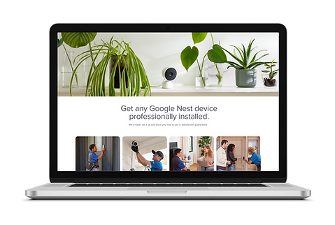
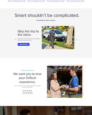
We started off by discussing the requirements with the team to ensure we were all clear on the expectations.
With this, examining the then-current state of the website.


01.02 DESIGN RESEARCH
LUXURY BRANDS
CLEAN DESIGN
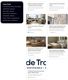
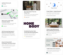
We researched a variety of smart home eCommerce websites and took inspiration from Google Nest website to help determine the direction for the landing page design.
To reflect the brand accordingly on the website design, we also focused on websites and brands with these qualities, such as luxury brands and those that provided a clean, modern, and upscale experience.
01.03 DESIGN METRICS

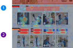
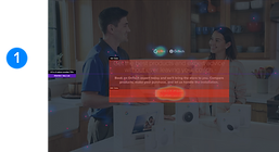
RESULTS REVEALED:
1
Design was not intuitive - users were clicking in each section, even if there wasn't a CTA
2
Attention dropped halfway through products, so importance on showing relevant products of interest
3
Users were not finding the information they needed - despite the lowest levels of attention being at the bottom of the page, it had more clicks than other sections. Specifically "Contact Us", "Installation Appointments", and "FAQ"
To best understand user frustrations, behavior, as the direction of what needs improvement, I gathered a variety of information from the live site on the tool Quantum Metric to help determine the areas for improvement direction to achieve this.
This research consisted of measuring interactions, click and tap rates, attention rates, and heatmaps within the prior 30 days.


01.04 UX RESEARCH
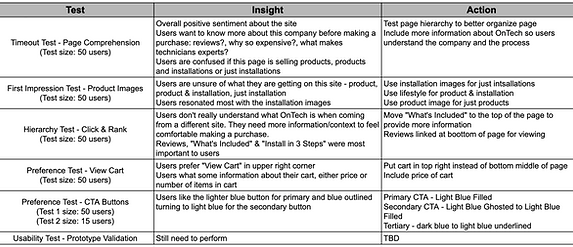
We met with the UX Researcher to go over our research needs, who then determined the needed tests.
SITE COMPREHENSION
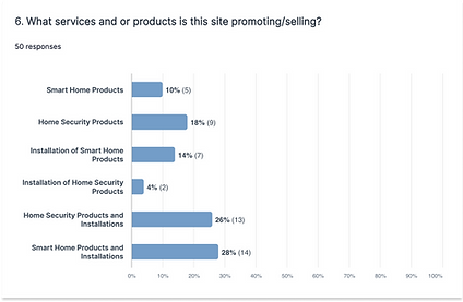
Tests: reading through site, clicking on areas that stood out, and clicking on an item to add to cart.
Insight: With every test, there was confusion as to what the site was actually selling - with most (54%) thinking products were included with the installations.
Action: More explicitly explain these are only installations and a product is needed for these skews.
IMAGERY FIRST IMPRESSION TESTING
We were looking to uncover which style would resonate most with customers. Users were asked what product or service they thought they were receiving with each image.
Insight: Imagery with the tech installing the device tested the best with indicating “installation”
Action: Use tech for installation, Use Lifestyle for installation + product, Use product for product only

HIERARCHY TESTING

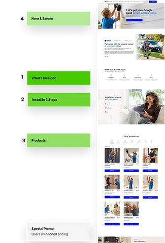
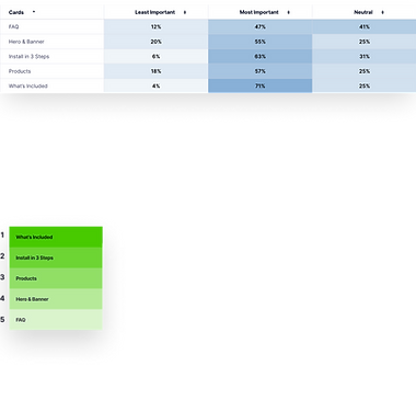
Insight: “What’s Included” and “Install in 3 Steps” include the information most important to users.
Action: Move, at least, “What’s Included” up to the top of the page so users see and understand it first. Move up “Install in 3 Steps” if we can.
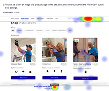
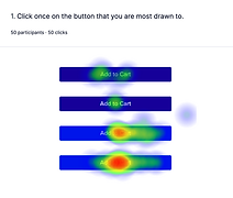
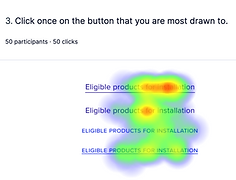
CTA BUTTON TESTING
Insights:
-
Users prefer the cart in the top right
-
Users want to know the price of their cart
-
Users like the lighter blue buttons
Action:


.png)
.png)
02DEFINE
02.01 DESIGN DIRECTION
With the research and findings in place, we had a design direction in place:
Elevating OnTech's brand awareness & brand trust
-
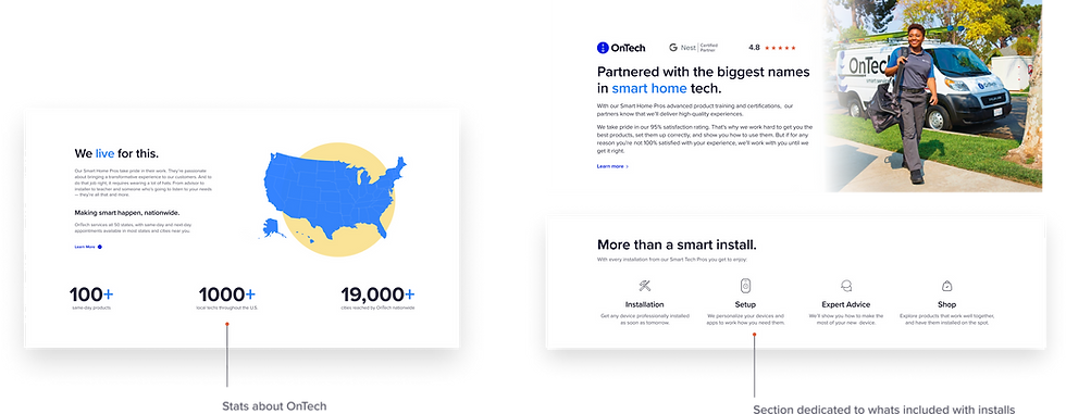
Placed a greater emphasis on customer testimonials
-
Designing a section that introduces OnTech to the customer
Enhancing the page flow & layout
-
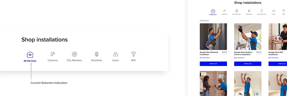
Adding a filtering option for products
-
Ensuring there are CTAs in sections where the customer can find more information
-
Adjusting the page hierarchy to better fit the user's areas of importance
-
Implementing a jump navigation to help users get to their desired section faster and to help inform users on what the page contains
Based off the research and design direction, the design decisions we made were:
ELEVATING BRAND AWARENESS & USER TRUST
1. Placing greater emphasis on user testimonials:
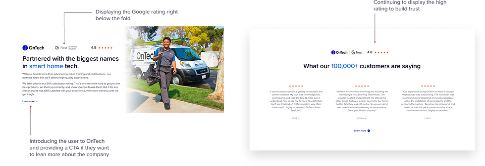
2. Adding sections that introduce OnTech to the customer:
ENHANCING THE PAGE FLOW & LAYOUT
3. Adding a filtering option for a more convenient and relevant shopping experience. Icons enable quicker scanning:
4. Page hierarchy - ensured the page layout and flow was based on user's preference:
5. Adding jump navigation:

03DESIGN
03.01 DESIGN ITERATIONS
With the design direction in place, we moved forward with the designs. Between designers we tackled different sections separately to design, checked in regularly, and co-designed other sections as needed.
This process considered the timeline for the designs and designing together for a more seamless design.


03.02 DESIGN WORKSHOP

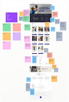

Although we had improved the original designs, we were having trouble deciding on the best design focus and wanted to further improve them.
To help with this and to ensure that we were meeting business expectations, we had a design workshop with the team, that we ran on FigJam.
03.03 FINAL DESIGNS
04TEST
04.01 PROTOTYPE
With the final designs in place, I added interactions for the prototype.
Here you can view both the final prototypes:
05HANDOFF
05.01 DEV HANDOFF
During the development process we ran into a variety of issues with restrictions with the used dev tools. To help mitigate this, clear communication was key to best create changes to the designs as ended, to ease the development issues.
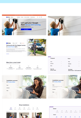
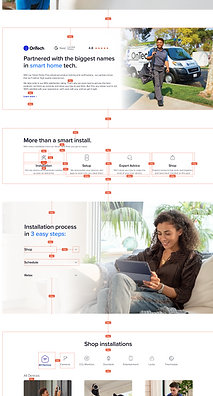
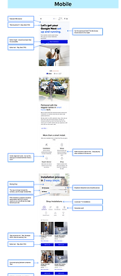
Besides meetings to go in-depth with expected site behavior and designs, I provided detailed annotations including:
-
Measurements of all elements and between elements on the page
-
Typography, color, and effects details
-
Expected interaction behaviors
-
The destination to all links
-
Google Sheet with a list of the elements to update that had been missed


06IMPACT
06.01 AFTER 1 WEEK
INCREASED
4.6%
Google web conversions increased by 4.6%
11.3%
DECREASED
Agent-placed orders decreased by 11.3%
-
Within the first week of launch we had already superseded the expected metric by an additional 3.4%
-
The expectation was to decrease agent-placed orders by 8%, and we achieved a decrease of 11.4%
-
For conversions, we reached a 4.6% increase of Google web conversions
-
95% QXscore (out of 100%) on UserTesting, which directly correlated to a great user experience
Besides these measurements, the click rate at the bottom of the page to "Contact Us", "Installation Appointments" and "FAQ", also decreased.
These results reflected the success of the redesign, that users not only were finding what they were looking for on the page, but it was what they needed in order to complete their purchases.


06.02 NEXT STEPS
The next steps would include the following:
-
Redesign the Steps section so that it's more easily understood what the steps are.
-
Redesign the Shop filtering in both desktop and mobile to better reflect the upscale design of OnTech Smart Services and for it to be in a format that users are already used to interacting with.
-
Redesign the containers within the Shop section, especially the secondary "More information" buttons so it's more visually consistent with the designs and not as confusing.
-
Find a better solution with developers for More Information popups, so when users click on "More information" they are able to see a Product Description Popup that is more engaging, appealing, and where they easily can find the information they are searching for.
-
Redesign the Featured Offer in a way that is more consistent with the upscale experience of the business.
06.03 REFLECTION
PRIORITIZATION
The project had been started by another agency prior to the team working on it. By then, we had only a small portion of the initial 6-month timeline.
This tighter timeline pushed the Designer, Researcher, and I to prioritize what was needed for the designs. To help, creating organized files and system was essential and helped with keeping track of it all.
INTENTIONAL DESIGN
Proper UX Research was pivotal for the foundation of the designs. This way, we made sure that we were providing users with what they needed in order to convert.
ADAPTABILITY
Shifting business needs and development tool limitations required a high amount of adaptability for the success of this project.
Initial designs had to be scrapped and re-thought several times to ensure they could be properly developed whilst meeting the relaunch timeline.


